# Stock Data in Timeseries form
- Stock data is organized in a dataframe such that the row index is the dates, and the columns are the stock symbols.
- Each dataframe will contain one metric i.e. lows, highs, volumes, etc
SPYtraded days are used as a reference to identify the days the stock market was open, other dates should be dropped from df- Normalizing is important to plot the data and observe increases/decreases across stocks that might fall in different price brackets. This is done by just dividing the entire dataframe by the first row, so all stocks start at price/volume of 1.
# Bollinger Bands
- Considers two standard deviations above and two standard deviations below the rolling mean to construct upper and lower bands respectively.
- If the upper bands is crossed, and the price begins to drop, potentially a good place to sell
- If the lower bands is crossed, and the price begins to climb back, potentially a good place to buy
# Statistical analysis
- Rolling mean/std: mean/std over a rolling window of days
- Daily Returns: Percent increase/decrease every day
- Cumulative Returns:
(end date price / start date price) - 1, multiply this by 100 to get the percent value
# Missing Data
- Lets say a stock is missing data in a certain time window, dont extrapolate or try to draw a line filling values between two dates. Because while extrapolating such a line you're using the info about the future state you have, and that makes your model biased.
Thefore, fill forward first with the last known value. This way you have covered dates having missing values after the stock came into existence. Then, fill backwards so you can fill for dates before the stock came into existence. Pandas'
fillnafunction withffillandbfillfor method does this.
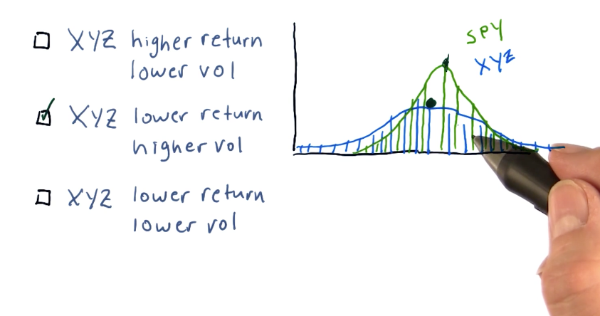
# Histogram
- Kurtosis tells us how fat the tails are in a gaussian distribution.
- This comes in handy for, lets say when we bin the daily return percents for a stock over time, and draw a histogram. The values will range from negatives to postives. The bell region of the gaussian gives us an idea of the standard return rates and standard deviation. The tails give us an indicator as to how frequent is there a large fluctuation.
- Fat tails (positive kurtosis) indicate that large fluctuations are frequent
- Skinny tails (negative kurtosis) indicate that large fluctuations are less-frequent.
# Scatter Plots
- To see relationship between, lets say daily returns of a stock vs daily returns of
SPY - When their daily return changes are plotted across two axis, we might see trends. Depending on how the scatter plot looks, there might be a positive linear, negative linear, quadratic, correlation, etc.
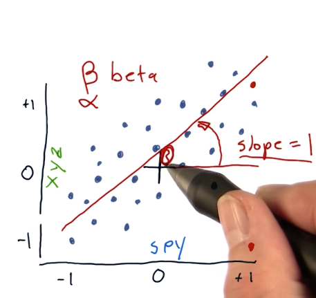
- In this, Beta would be the slope of the line. Slope 1 would mean, if SPY went up by 1, XYZ seems to go up by 1.
- Alpha indicates the point where the line intercepts the vertical axis (look at bulls eye drawn with the black marker which is the center point). In this case, the line intercepts the vertical axis above the center point, which indicates the XYZ stock performs slightly better than SPY on a given day.
Slope does not indicate correlation. How closely are the dots are packed does.
Use
np.polyfitusing polynomial to compute the slope coordinates